


We moved!
Help articles have been migrated to the new Help and Support. You can find help for your products and accounts, discover FAQs, explore training, and contact us!
Select a cell in the designer grid where you would like to place a chart and choose Insert > Chart.
Notes
- A cell in the Report Designer that contains a chart is indicated by a light-blue tag in the top-left corner. The chart is visible only when you preview or print the report or statement.
- To format an existing chart, select the row in which the chart was inserted, and choose Format > Chart.
- To delete an existing chart, select the cell in which the chart was inserted and choose Insert > Remove Chart.
See also: Inserting a chart
Tabbed pages in this dialog
Select one of the following chart types to insert in the selected report.
| Column
|
| Bar
|
| Line
|
| Area
|
| Scatter
|
| Pie
|
| Doughnut
|
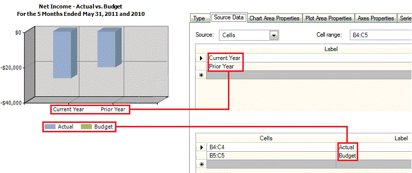
Cell range. Enter the range of cells that define the data points in the chart. (For example, enter B4:C5 to include amounts that are within the cell range of current year and prior year budgets.)
Labels. Define the collection (data points) labels for the chart.
Series labels. Define the series (legend entries) labels for the chart. To display the legend with the chart, use the Legend Properties tab.
Was this article helpful?
Thank you for the feedback!

|
|

|
Get the most out of your Thomson Reuters Tax & Accounting products. Our continued learning packages will teach you how to better use the tools you already own, while earning CPE credit. Learn more. |

|
|

|
Chat - Best option for simple questions Call us at +1 800 968 0600. You might like to see our hours and menu options before calling |