
 Accounting CS

We moved!
Help articles have been migrated to the new Help and Support. You can find help for your products and accounts, discover FAQs, explore training, and contact us!
You can use the Layout Designer to create custom layouts or edit preformatted layouts for the following checks and forms in Accounting CS.
- 1095 Forms
- 1099 Forms
- Accounts Payable Checks
- Accounts Receivable Forms
- Billing Invoices
- Invoices
- Statements
- Deposit Slips
- Payroll Checks
- Vendor Checks
- W-2 Forms
Choose File > Layout Designer to open the Layout Designer screen.
Main elements of the Layout Designer
The Layout Designer includes standard and formatting toolbars plus the Layout list frame, the design grid, and the Design Tools frame. Colors are used in the designer to represent different areas in the work area of the form. Show me.
| Color | Description |
|---|---|
| Yellow | Repeating region |
| Green | Check region |
| Blue | Header and Footer regions |
Notes
- To resize frames within the Layout Designer, position the mouse pointer over the vertical border of a frame in the current screen. When the mouse pointer changes its appearance to a
 , click and drag the border to adjust the frame size.
 - Click the push pin
 button on the title bar of the Design Tools frame to toggle the auto-hide feature on or off. When auto hide is toggled on, you can slide your mouse pointer over or away from the Design Tools tab to display or hide the Design Tools frame. When auto hide is toggled off, the Design Tools frame remains open at the right side of the Layout Designer screen.
 - Choose Edit > Select All, or press CTRL+A to select all elements in the design grid, and then use the up/down and left/right arrow keys on your keypad to make slight placement adjustments. Click a blank area in the grid (white space) to deselect all elements.
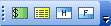
Layout Designer toolbars
The Layout Designer toolbars in Accounting CS provide convenient formatting tools at your fingertips. The following illustrations show the Layout Designer toolbars and describe each button and its function.

| Button | Function |
|---|---|
 |
Adds a new layout to the Layouts list frame and opens it in the Layout Designer grid. |
 |
Opens the Documents list frame where you can open an existing layout, create a new report, create a new folder or subfolder, copy, paste, delete, and rename folders and reports. |
 |
Saves any changes you have made to the layout. |
 |
Prints the layout to the default printer. |
 |
Opens the Print Preview screen, where you can preview sample data. |
 |
Removes the last action that was applied in the Layout Designer. |
 |
Re-applies the previous action in the Layout Designer. |
 |
Checks spelling in the sheet that is currently open in the Layout Designer. |
 |
Removes selected items in the layout workspace. Press CTRL+X to perform the same action. |
 |
Copy selected items from the layout workspace to the clipboard. Press CTRL+C to perform the same action. |
 |
Paste selected items from the clipboard into the layout workspace. Press CTRL+V to perform the same action. |
 |
Delete the selected items from the layout workspace. Press the Delete key to perform the same action. |
 |
Pointer tool. |
 |
Text tool. |
 |
Zooms in or out on the layout based on the percentage selected. |
 |
Searches Help Launches the main help topic for the Layout Designer in the Help & How-To Center. |

| Button | Function |
|---|---|
 |
Toggles bolding on and off. You can click this button, type the text, and click the button again to turn bolding off; or you can highlight the text you wish to change and then click this button. |
 |
Toggles italics on and off. You can click this button, type the text, and click the button again to turn italics off; or you can highlight the text you wish to change and then click this button. |
 |
Toggles regular text underline on and off. You can click this button, type the text, and click the button again to turn the underline off, or you can highlight the text you wish to change and then click this button. |
 |
Toggles accountant's underline on and off. Highlight the amount you wish to change and then click this button. |
 |
Toggles accountant's double underline on and off. Highlight the amount you wish to change and then click this button. |
 |
Left justifies the content in the layout workspace. This alignment is the default. |
 |
Centers the selected content in the layout workspace. |
 |
Right justifies the selected content in the layout workspace. |
 |
Select a font color for the selected font in the layout workspace. |
 |
Select a line color for the selected line in the layout workspace. |
 |
Select a color for the cell background from the available color palette. |
 |
Select a line weight for the selected line in the layout workspace. |
 |
Select a line pattern for the selected line in the layout workspace. |
| Button | Function |
|---|---|
 |
Define the check area in the layout workspace. |
 |
Paste a region that is repeated in the layout workspace. |
 |
Create the header region in the layout workspace. |
 |
Create the footer region in the layout workspace. |

| Button | Function |
|---|---|
 |
Create a line in the layout workspace. |
 |
Create a rectangle in the layout workspace. |
 |
Create a rounded rectangle in the layout workspace. |
 |
Create a ellipse in the layout workspace. |

| Button | Function |
|---|---|
 |
Group selected items in the layout workspace. |
 |
Ungroup selected items in the layout workspace. |
 |
Bring selected items to the front in the layout workspace. |
 |
Send selected items to the back in the layout workspace. |
 |
Rotate selected items to the right in the layout workspace. |
 |
Rotate selected items to the left in the layout workspace. |
 |
Align selected items in the layout workspace (Left, Center, Right, Top, Middle, Bottom). |
 |
Equally space items horizontally in the layout workspace. |
 |
Equally space items vertically in the layout workspace. |
 |
Adjust the height of a selected object in the layout workspace. |
 |
Adjust the width of a selected object in the layout workspace. |
 |
Adjust the size of a selected object in the layout workspace. |
Design Tools frame
You can format text and add variables in a layout within the design grid, as well as customize layout properties.
Variables section
This section includes a tree-view list of a wide variety of variables that you can insert into the selected layout. Each variable is replaced by the current client's data when you print or preview the document.
Text section
This section provides many of the same text formatting tools that are included on the Formatting toolbar of the Layout Designer, as well as a More text options link that opens the Text dialog for quick access to additional tools.
Properties section
You can use the Properties section of the Design Tools frame to adjust the size and position of the selected element in the design grid. Also, based on the element that is selected in the design grid, different options are available to customize the layout.
For example, when you select a variable, you can choose an appropriate period that is associated with that variable from the Period field. And when you paste a region that is repeated (yellow) in the layout workspace, you can choose to designate that region as a continuation of a repeating region that already exists in the layout.
Drawings and Regions
You can use the Drawings and Regions section of the Design Tools frame to drag and drop drawing elements and regions into the design workspace, and use the Formatting section to define line color/pattern/weight, fill color/pattern, and fill pattern color.
Other features
- Red triangles in cells and/or rows indicate that a conditional expression has been applied the the specific row or column in the report.
To view a conditional expression in the design grid, select the cell or row that contains the expression and choose Format > Conditional Expression.
Was this article helpful?
Thank you for the feedback!

|
Repeating rows and regions in a layout |

|
Get the most out of your Thomson Reuters Tax & Accounting products. Our continued learning packages will teach you how to better use the tools you already own, while earning CPE credit. Learn more. |

|
|

|
Chat - Best option for simple questions Call us at +1 800 968 0600. You might like to see our hours and menu options before calling |